Colour Psychology in Interior Design
Colour is one of the most powerful tools in interior design.
It has the ability to shape mood, influence emotions, and transform the way we experience our surroundings.
While many people choose colours based purely on aesthetic preference, the psychology behind each shade reveals a deeper truth: your home’s palette doesn’t just look beautiful, it also affects how you feel within it.
Why Colour Matters in Interior Design
The link between colour and emotion. Colour and emotion are deeply intertwined.
From the calming serenity of a soft blue wall to the vibrant energy of a yellow accent, the shades you surround yourself with can uplift, soothe, or invigorate.
This connection isn’t accidental. Our brains respond instinctively to colour, influencing mood, focus, and even physical energy levels.
How interiors influence wellbeing
Interior design is about more than placement and proportion, it’s about atmosphere. A room’s colour scheme can make it feel warm and inviting or cool and distant.
It can enhance relaxation in a bedroom, boost creativity in a studio, or encourage conversation in a dining room.
By choosing colours with intention, you create spaces that support your lifestyle and wellbeing.
Understanding the Psychology of Colour
What is colour psychology?
Colour psychology is the study of how colours affect human behaviour and emotions.
While cultural associations vary, many responses are universal: blue is calming, red is energising, green is balancing.
In the home, colour becomes a tool to design environments that feel aligned with how you want to live.
Why it’s important for creating intentional spaces
Without mindful choices, interiors can feel disconnected or overwhelming. Colour psychology allows you to design with purpose.
Instead of simply decorating, you’re curating experiences. A restful retreat, a lively gathering space, or a warm sanctuary for everyday rituals.
Colours and Their Emotional Impact
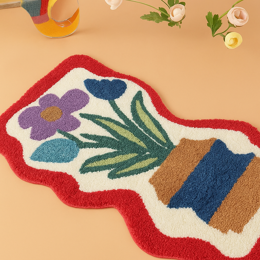
Each colour carries its own energy. Here’s how the most popular shades influence mood at home, and where they work best.
Blue ~ calm and restorative
Blue is often associated with serenity and clarity. It slows the heart rate, lowers stress, and encourages relaxation.
Soft, muted blues are ideal for bedrooms or bathrooms, creating a spa-like sense of tranquility.
Deeper navy tones bring sophistication to living spaces, especially when balanced with warm neutrals.

Green ~ refreshing and balanced
Green evokes nature, growth, and renewal. It creates harmony, making it one of the most versatile colours in interiors.
Sage or olive tones feel grounding in living rooms, while brighter greens can energise kitchens and dining spaces.
As a symbol of balance, green works beautifully wherever you want to foster calm connection.

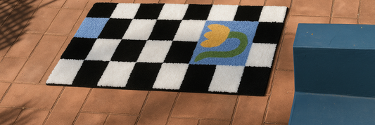
Yellow ~ uplifting and energising
The colour of sunlight, yellow radiates warmth and optimism. It stimulates creativity and energy, making it perfect for kitchens, hallways, or workspaces.
Soft buttery yellows feel cozy and nostalgic, while brighter shades add vibrancy and playfulness. Use yellow thoughtfully, as too much intensity can overwhelm.

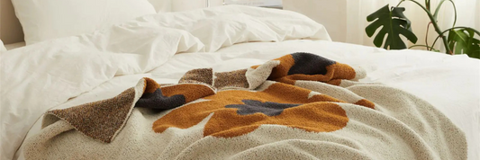
Red ~ passionate and stimulating
Red is bold, powerful, and stimulating. It can spark conversation, heighten energy, and even increase appetite.
Deep burgundy or terracotta tones bring richness and depth to dining rooms or accent walls, while brighter reds work best in smaller doses — through accessories, textiles, or artwork.

Neutrals ~ grounding and timeless
Neutral palettes — creams, taupes, warm greys, and soft browns — are the foundation of many modern interiors.
They create calm, grounding backdrops that allow texture and form to shine.
Neutrals work in every room and can be layered with accent colours to create depth without overwhelming the senses.

Dark shades ~ cozy and dramatic
Charcoal, deep green, and midnight blue create intimacy and drama.
Far from making a space feel small, darker hues can cocoon a room in warmth, making them perfect for snugs, reading nooks, or statement walls.
Paired with warm lighting, dark tones feel luxurious and inviting.

Pastels ~ playful and lighthearted
Pastels carry softness and charm. Powder blue, blush pink, or lavender bring a sense of ease and whimsy, making them ideal for nurseries, creative spaces, or light-filled corners.
Their subtlety allows them to blend easily into layered interiors without dominating.

How to Use Colour Intentionally at Home
Knowing what colours represent is only the beginning — the art lies in how you apply them.
Balancing bold and neutral tones
Bold colours create impact, while neutrals offer calm. A well-styled home strikes harmony between the two.
For example, pair a terracotta feature wall with cream textiles, or anchor a navy sofa with a neutral rug. The contrast creates visual interest without chaos.
Using accents versus statement walls
Not every colour needs to cover an entire wall. Accents — in the form of cushions, vases, rugs, or artwork — allow you to experiment with mood in a subtle way.
Statement walls, on the other hand, are powerful when you want to anchor a space with presence and character.
Layering colour with textiles and accessories
Textiles, ceramics, and accessories offer endless opportunities for colour play.
A muted sofa can be elevated with pastel cushions; a neutral rug can ground a vibrant accent chair.
Accessories allow you to refresh palettes seasonally without committing to permanent changes.
Matching colour choices to your lifestyle
Ultimately, colour should reflect how you live. If you seek calm after long days, lean into blues, greens, and neutrals.
If you thrive on energy and activity, infuse your home with yellows, reds, or bold accents. Your home should align with your rhythms, supporting you in both rest and activity.
Final Thoughts: Designing with Colour and Connection
Colour is more than decoration. It’s a language that speaks to our emotions and shapes our experiences at home.
By choosing palettes intentionally, you create spaces that are not only beautiful but also meaningful, supporting the life you want to live.
At Haus of Winston, we believe that a well-styled home is the foundation of life’s most meaningful moments.
Through colour, texture, and timeless design, you can shape interiors that bring comfort, connection, and a sense of everyday luxury.